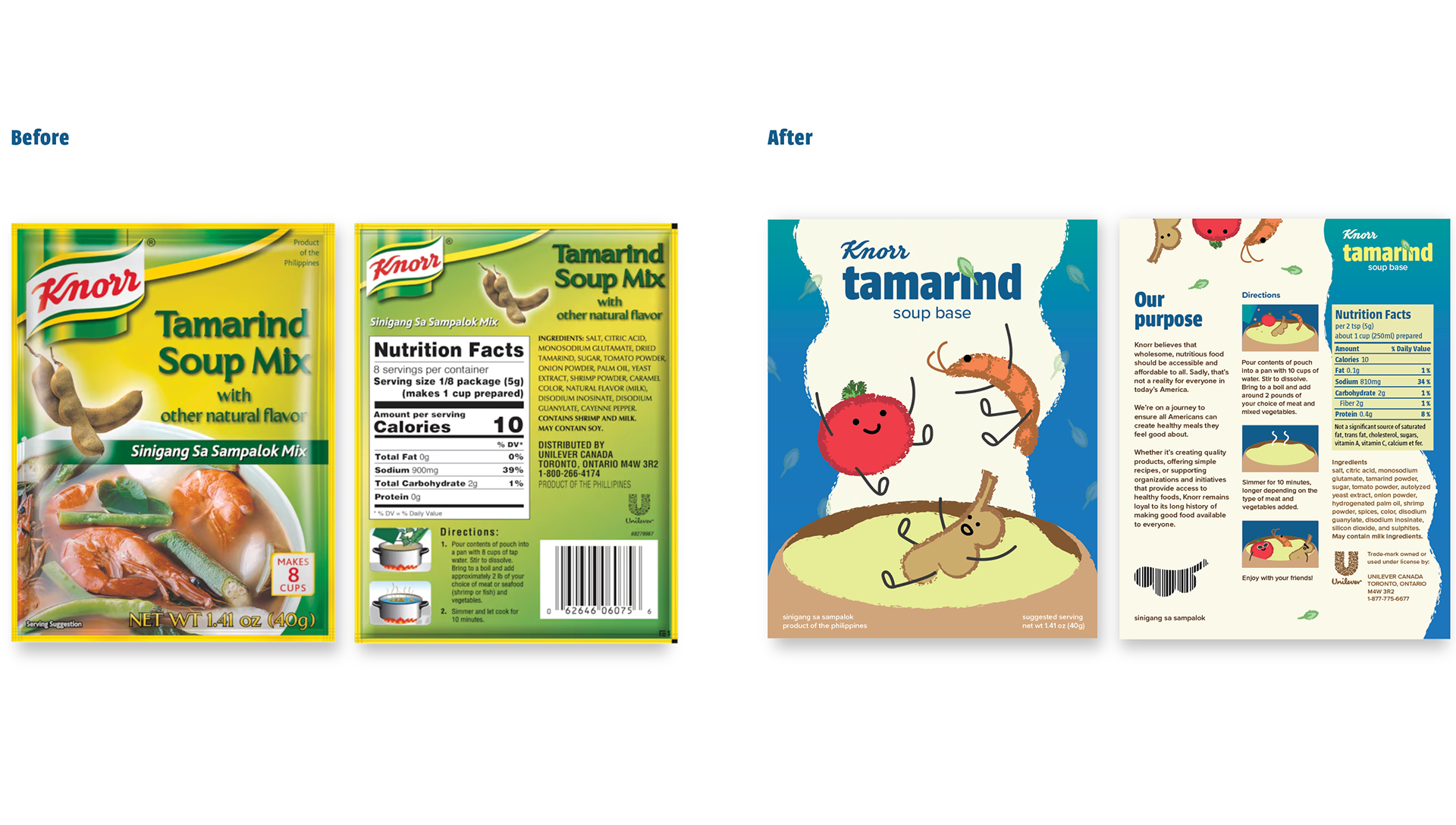
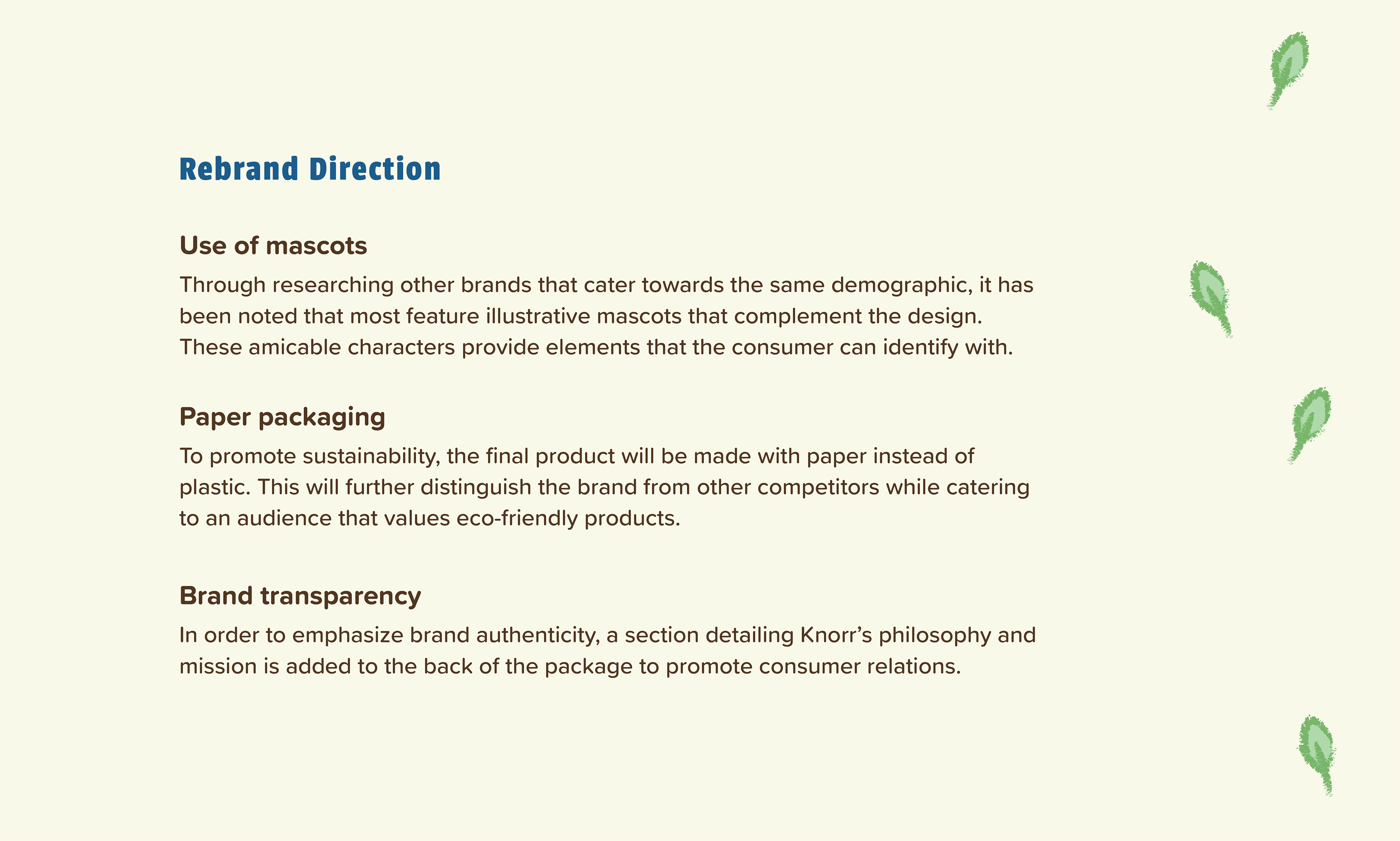
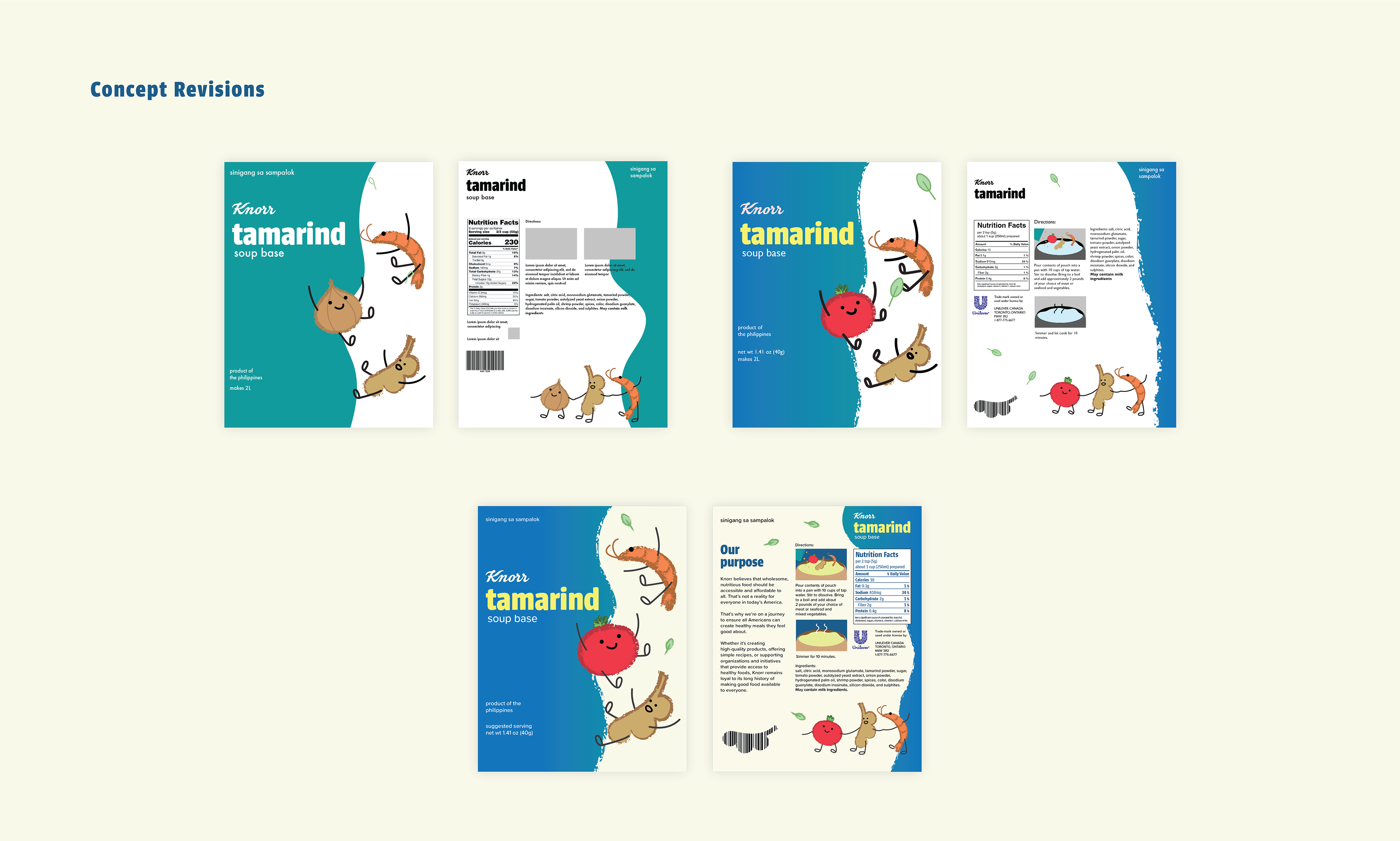
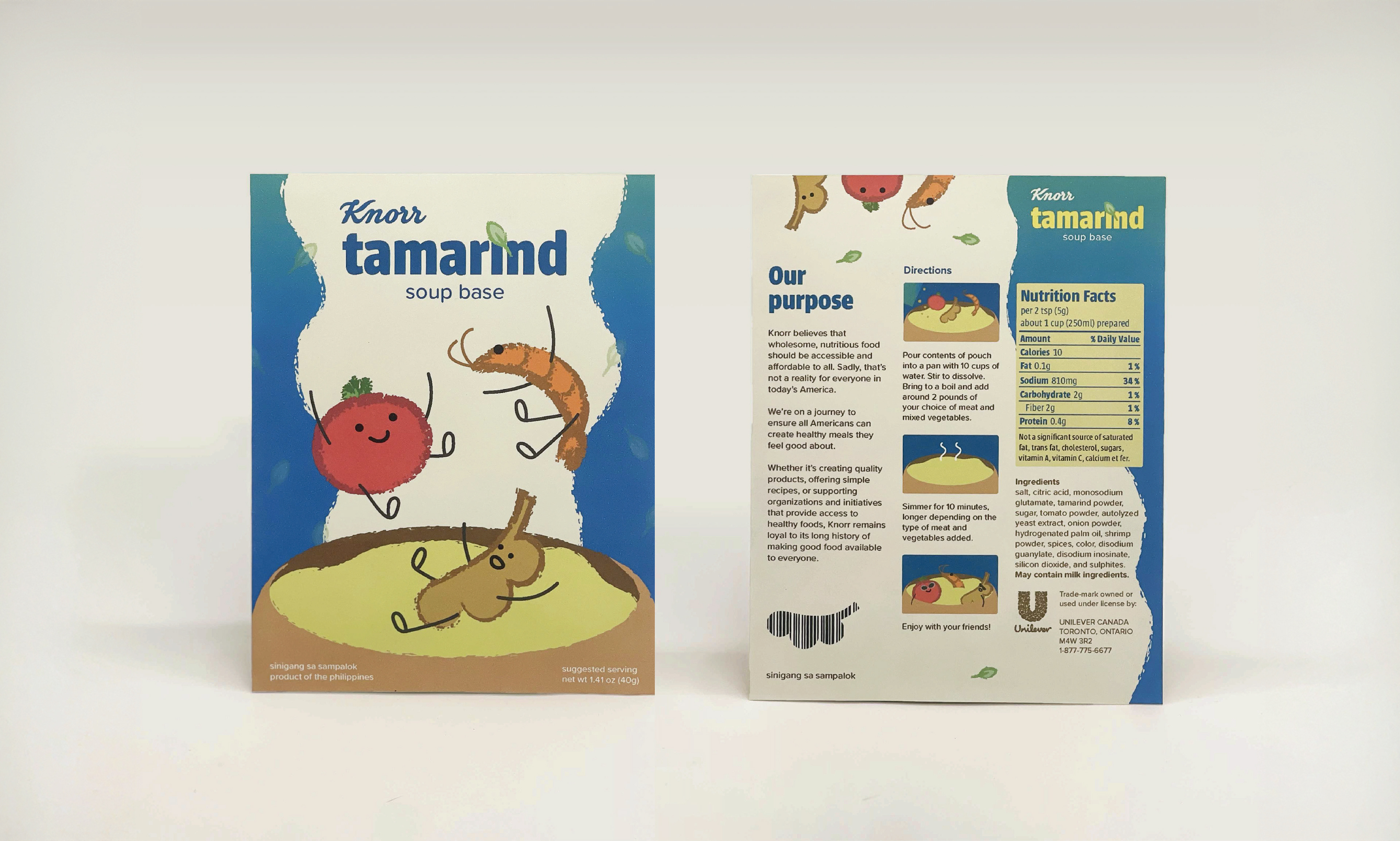
This rebrand is appealing Knorr to younger and diverse audiences.
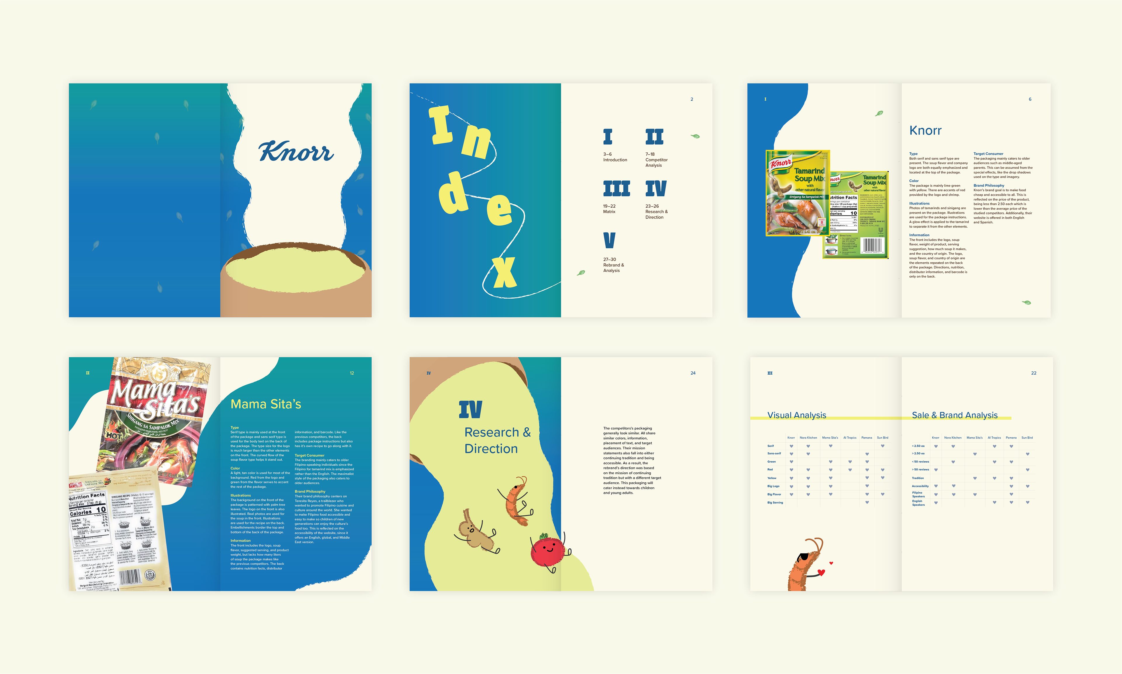
Knorr is a food brand that mainly sells soups and seasonings. The company’s Philippine branch sells tamarind soup mix: the base for a popular Filipino dish, sinigang. Though the product is popular among Filipinos, the niche soup flavor and dated packaging discourage the curiosity of more general audiences. The rebrand needed to address these concerns while also staying authentic to the company's vision.
Skills: Illustrator, Indesign, Photography
Duration: 15 weeks
Design Research:
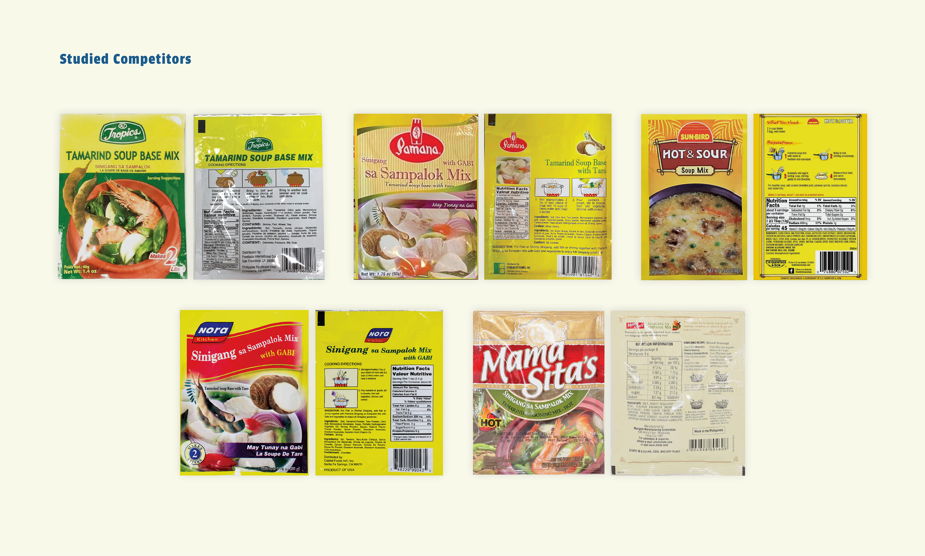
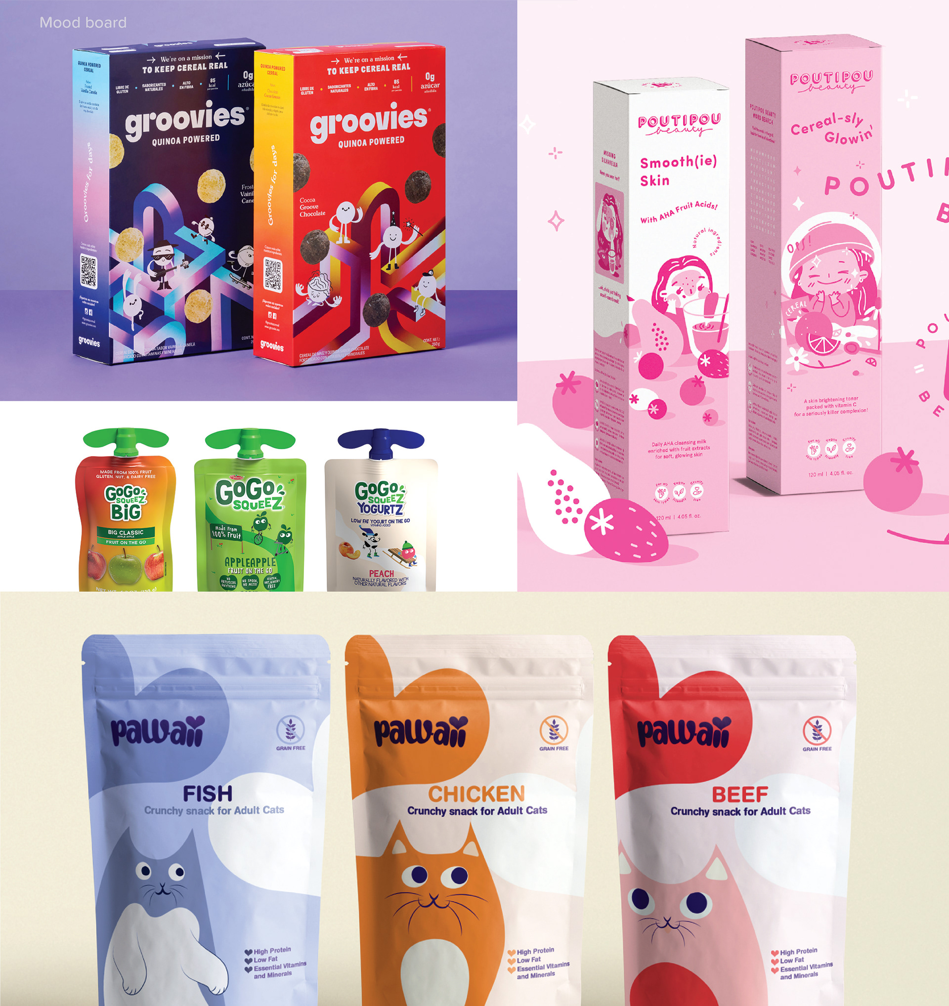
Preliminary research was centered mainly on analyzing brand competitors. Visual elements such as the usage of color and typography were studied as well as brand philosophies and target audiences. This process helped inform the tone and character of the new product.


Research Booklet:
All research conducted for the redesign was organized into a booklet. In-depth analyses on competitor typography, illustrations, color, etc. were documented. In addition, the original packaging and competitors were compiled into a matrix for ease of comparison.
What I learned:
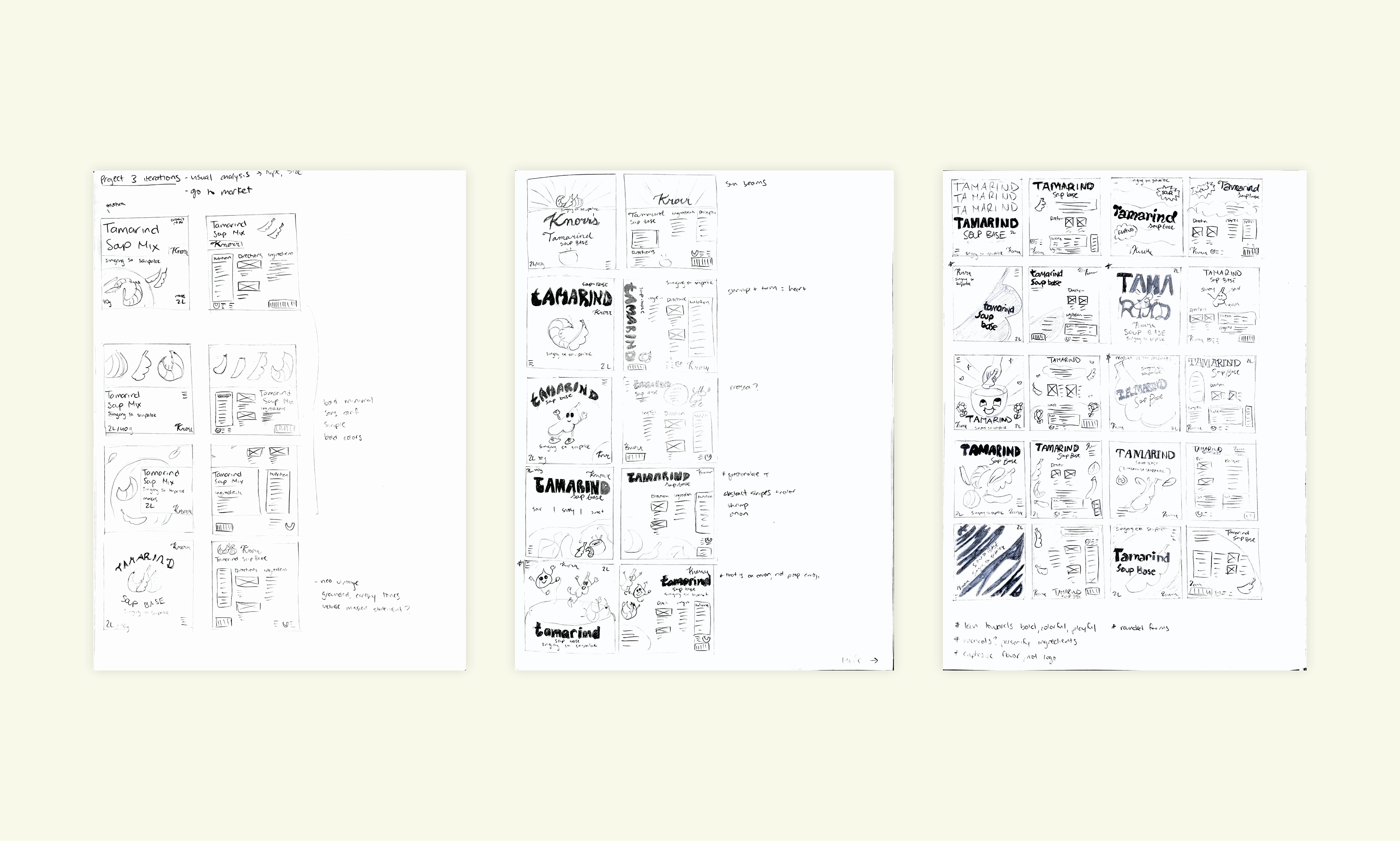
When I first tackled this project, I was overwhelmed by the many different directions I could take with the rebrand. I learned that doing research first and discovering problems that could be explored narrowed the scope of potential ideas. This led to my sketches being created with more intention. I became familiar with the process of conducting design research and how important it is to make decisions based on existing data.